Earlier today I inundated you with every possible combination of striped walls you could imagine. Horizontal, vertical, bold, subtle...and in the hopes of finding a striped look for Knox's future big boy room. I'll be posting a full inspiration board for this room in the future but for now just know that this is where I'll be using the Jenny Lind beds I scored last year on Craig's List.
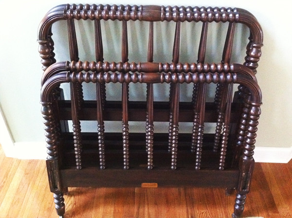
And get this - I'm even considering leaving them in their natural, very good condition dark wood stain. GASP! I KNOW! Me! Who will paint anything! But I'm sorta digging the warmth and anchoring ability of the dark wood against some other graphic accents.
I think I'm going here with bedding.


Here's the problem though - I actually have 2 of this same image in my inspiration files and they are ever so slightly different. This is the other one.

See the difference? The one on the right is definitely more blue than gray. Of course I'm left to wonder which is the "real" image of this room, free of any photo manipulation. I don't know the original source so I guess I'll never know. Either way, both are pretty.
After staring at this image for far too long, I've narrowed down what I hope are some paint options for achieving a similar look - 2 colors in the blue/gray range and one white, perhaps even slightly creamier color.


Option #2 is all from the same color card...which would definitely be the easiest way to go except I don't think the lightest color, Polar White, is quite white enough.
Option #3 starts with my favorite robin's egg blue color (that I used on my campaign dresser), the color above it on the same paint chip and then the same pure white from Option #1. I like it...but is it too blue? Or just right for creating the effect in the second image?
Option #4 is more of a hodge podge. It's almost exactly like Option #1 except for the middle color which I think it grayer than in Option #1.
Which image do you prefer? The gray stripes or the blue? And which color combination would you go with?

0 Comments:
Post a Comment