Tuesday, April 3, 2012

IKEA Malm Dresser Makeover with O'verlays


I have been wanting to experiment with O'verlays ever since they came out.  I think the product is ingenious and the perfect way to elevate even the most mundane big box furniture.  So when my friend Christiane started thinking about redoing an old IKEA Malm dresser to use in her son Hudson's room, I jumped at the chance to help!

Hudson's room has some great roman shades made of Dwell Studio's Dotscape in Major Brown


And his ceiling is painted this super fun green.


After some brainstorming, we decided to pair a smokey, high gloss gray on the overall dresser with the Lolita circle O'verlays to play off the circle motif started on his roman shades.  Painted in the same green as the room's ceiling, it really brings the whole color scheme together.

I'm not going to re-invent the wheel and give you a whole tutorial on how to paint the dresser.  I'll defer to Kate's excellent posts on how to do that here.  I taped, primed (using my favorite primer - Zinsser Cover Stain) and painted it very easily since the Malm is just a bunch of flat surfaces with no nooks or details to speak of.  Pretty much a furniture painters dream!


There aren't a ton of colors in the Rustoleum Protective Enamel Oil line but if you can find one that works for your project I HIGHLY recommend it.   They're sold near the spray paints and come in quart size which is perfect for a small project like this.  And the best part - they're only about $8!  Yes, oil paint can be a pain to work with and clean up but I think it's completely worth the trouble for the professional looking finish you get.  Just be sure to follow your local waste regulations for disposing of your oil based paint cans.


After a couple of coats with a brush, I had this glass-like, perfectly glossy surface.  Oil paint takes a lot longer to dry than latex so resist the urge to touch it or do a second coat until you've let it completely dry (overnight is best).


So that was the easy part!  But then I got started on painting the O'verlays themselves and thought I was going to die.  My recommendation to you if you're considering using and painting some O'verlays - SPRAY PAINT, SPRAY PAINT, SPRAY PAINT!  Pick a color that you can spray on and don't look back.  

Since I wanted to match the O'verlays to the existing ceiling color, I started by rolling my paint on.  


 That was fine, except for this...


See all those totally-unreachable-by-a-roller nooks? After debating everything from hand painting all of them with a foam brush (aaaaargh!!!) to physically dipping the entire O'verlay into the can of paint (and then dealing with drips!), I remembered I had this Martha Stewart Crafts spray paint kit in my craft supplies.  The instructions make it pretty clear that it's for use with acrylic/craft paints but I was desperate. 


And guess what?!  IT WORKED!!!  The process for using the kit couldn't be easier.  You simply mix your paint with the spray paint medium included in the kit in a 1 to 1 ratio, attach the sprayer and start spraying.  You can watch Martha demo the process here.  About 2 oz of my Benjamin Moore latex paint is all it took to get complete coverage on all my O'verlays and save me hours of hand painting and cursing up a storm. I stuck them on with a little bit of Liquid Nails.


Here it is in Hudson's super cute room.


So let's recap what we've learned:
1.  Oil paint is awesome
2.  O'verlays are awesome
3.  When in doubt, spray, do not brush
4.  Go buy the Martha Stewart Crafts spray paint kit

Monday, October 3, 2011

I'm back and I'm a super sleuth!

I'm back from vacation rejuvenated and excited for the month ahead.  It's going to be a busy one with Knox's first birthday party, a visit from my family and of course my favorite - HALLOWEEN!

But first, a bit of housekeeping!  I want to thank all of the wonderful guest bloggers that filled in for me last week.  I loved checking in every day and reading your comments to what they came up with.

--Ashley of Meet Me in Philadelphia's post on easy details that can transform your home from ordinary to extraordinary.  

--Danika of Gorgeous Shiny Things's mindblowingly great DIY for using an O'verlays + IKEA Ribba frame to create chic jewelry storage.  I'll be announcing the winner of the O'verlays giveaway at the end of the week.  If you still haven't entered, you can do so here.

--Sarah of Pewter + Sage's detailed study of what stays and what goes in the transformation of her daughter's current nursery to a (maybe someday) baby's boy space.

--Jenn of Arcadian Home's roundup of inspiring laundry room's you'd never want to leave.

-- I'll also be announcing the 3 winners of the ScotchBlue™Painter’s Tape with Edge-Lock™ Paint Line Protector at the end of the week.  If you still haven't entered, you can do so here.

And speaking of the ScotchBlue™Paint Party that inspired my striped room, I got several emails from reader's asking for a source list for some of the items featured in the original inspiration image - specifically that fantastic rug!  This is one of those images I had saved forever and I knew it was originally from Cookie magazine but I had no idea which issue. 


Lauren of With Two Cats did a fantastic job recreating the look in this post but your emails motivated me to dig through my Cookie archives and track down the original.  Yes, I have a Cookie archive...don't judge.  This is just a few.


After lots of furious page flipping, I found it in the issue with Tori Spelling on the cover.


Talitha Cotton via Madeline Weinrib

The rug is the Talitha Cotton rug by Madeline Weinrib.  Sadly it's nowhere to be found on the site which may mean it's discontinued.  The turquoise version appears to still be available via Lotus Bleu Designs.  If you have your heart set on the indigo/white version in the original image, it might be worth a call to ABC Carpet.  If anyone can track it down for you, they can.

Other items of interest - 
The fabric used on the roman shade is Fokus by Marimekko available here.


The bedding is the 50s birdcage duvet originally from Urban Outfitters, now discontinued.  But I'd set up a search agent on eBay for it...these things always pop up.


Friday, September 23, 2011

Modern Decor: Paloma's Nest Menagerie Kid's Collection

You might know Paloma's Nest from her ubiquitous ring bearer bowls.  Their popularity spread like wildfire and they've been appearing at stylish weddings from coast to coast.  BUT did you know she's also recently released a collection of stunning heirloom gifts for kid's?

Her marching menagerie collection of wheeled animals are handcrafted from the same white clay that put Paloma on the map.  These adorable animal silhouettes are mounted on wooden wheels and are just begging to grace a bookshelf in your little one's nursery.  They come in a large and tiny size and the hardest decision you'll have is picking an animal!  I think the rhino is my personal favorite (rhinos have a special place in my heart).


As if that wasn't adorable enough, the menagerie cuteness continues with her line of animal silhouette chairs and table!  Handcrafted of birch and perfectly pint-sized, they are just the finishing touch for a chic playroom.  I mean...the gorilla chair?!  Seriously...TOO CUTE!
If you love this collection as much as I do, head over to Design Mom where a giveaway is going on.  Someone's going to win, you get to pick your favorite chair!

Tuesday, September 6, 2011

Shared (but separate) kid's bedrooms

I get a lot of emails asking for ideas on how to handle shared bedrooms among siblings.  Somewhere in all of these emails there is always a line that goes something like this:

"I want each child to feel like their space is personal but I don't want the room to feel like a complete hodge podge of things that don't look good together."

This can definitely be a challenge, compounded even more so when you have a boy and a girl sharing a space.  So today I am sharing some of my favorite images of children's bedrooms that I think manage to be shared but also separate.  {And because you all seem to hate them, for the purposes of this post, I am eliminating any bunk bed spaces.}

The easiest solution to this problem is to use color to clearly delineate separate and unique sides to the room.  Color is a very strong variable so to keep things from looking all together crazy, it is best to maintain some consistency with the other major elements.  If you study the images below you will see this in action.  Different colored walls but same bedding/headboards, different colored curtain panels (on the same window!) but same beds, etc.


A bit more complex (but equally effective) solution to this problem is to divide the room with some kind of architectural feature.  If space allows, lining the beds up against a wall and place a tall bookshelf (built it or free-standing) between them can give each bed just the feeling of seclusion you need. 


Even placing a desk or nightstand between them can go far to helping you create separate spaces for each child.  And of course, personalizing with things like art, monogrammed pillows and each child's favorite stuffed animals never hurts either.  The key is again, to keep the elements consistent.  In the image below, that's achieved by using art that is typographically the same but in 2 different colors.  The same can be said for the bedding. 

Did you share a room with a sibling growing up?  Or do your kid's share a room now?  What tips do you have for letting each one's personality come through?

Wednesday, August 31, 2011

My formula for the perfect playroom

Last week I sounded the "HELP" alarm and asked you guys to chime in on where I should put a playroom in our house.  I shared the full floor plan for the first and second floors and gave you 2 options - the current formal living room and the large bonus room upstairs. You were all amazing (of course) and so willing to help!

Your vote?  A resounding 3rd option that I had literally never for a second even considered.  Moving the current study (which is right off of our family room) into the formal living room space and making the study the playroom.

I sat here dumbfounded as one comment after another came in with this same suggestion.  Oh yes, I resisted at first.  Mostly because I love the office space.  It's so...finished :)  And the idea of tearing 2 rooms apart instead of one was giving me hives.  But I pushed past that and thought about it all last week.  And y'know what...you guys are 1000% right!

CUE THE APPLAUSE AND TICKER TAPE!!!  You people are BRILLIANT.

Yes it will be more work in the end but it is the right answer for our family at this time so I'm forging ahead.  Of course as with any space, I like to start by identify the absolute requirements for the room and then build from there.  So I've been considering how I want the playroom space to function and I think I've nailed down the perfect (for us at least) formula for creating a functional and inspiring play space.


Of course I recognize the benefits of closed storage but I think you need a mix of both open and closed storage to make things more accessible for the little ones.  For me that means a mix of drawers, shelves bins and baskets. 


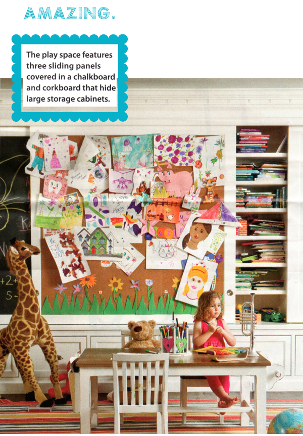
These sliding cork & chalkboards continue to haunt me.  I am determined to work this idea into the playroom space if it kills me.  My goal is to figure out how to do it without springing for built-ins because if there's one thing I'm learning from this whole room switcheroo I'm about to undertake, it's that our needs as a family are changing too fast to commit to any one room's long term function.


Next up, an art corner!  Early on, that really just means a table and a chair but I want to be sure there's room in this area to grow into an organized craft/color/drawing zone.


A reading nook or lounging area is a must in my book.  Kid's LOVE tight little cozy spaces.  Unfortunately, the room I'm working with doesn't have a closet or you'd better believe I'd whip that into a nook in 2 seconds!  I'll make something work, even if it's just some plush pillows in a corner with a light and some shelves will do but boy is that teepee calling to me!  Does a teepee qualify as a reading nook?


By working in a healthy dose of storage and dedicated "zones" for relaxing and creating, I'm hoping to allow for a good open area of space in the middle of the room.  I don't want to fill the room up with so much stuff that there isn't open playing space available! 


WILD CARD!  Wouldn't a playroom be the perfect place to go a little nuts with a fun ceiling treatment?! I've got a few thoughts rattling around but I'm not quite sure just yet where I'll land. 
{all images + many more via my Kid's Room board on Pinterest}

So what do you think?  Am I missing or overlooking anything significant?  And why do I want a teepee so darn badly?  I will take any and all advice you have...obviously since I'm letting you decide what rooms become what in my house!

Tuesday, August 30, 2011

Achieving subtle, graduated stripes

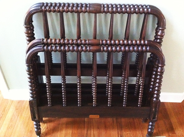
Earlier today I inundated you with every possible combination of striped walls you could imagine.  Horizontal, vertical, bold, subtle...and in the hopes of finding a striped look for Knox's future big boy room.  I'll be posting a full inspiration board for this room in the future but for now just know that this is where I'll be using the Jenny Lind beds I scored last year on Craig's List.


And get this -  I'm even considering leaving them in their natural, very good condition dark wood stain.  GASP!  I KNOW!  Me!  Who will paint anything!  But I'm sorta digging the warmth and anchoring ability of the dark wood against some other graphic accents.

I think I'm going here with bedding.

Among all the striped pics I post, I gravitated the most toward this one.  Modern, clean, simple...but not boring.  I love the little bit of red peaking in here too from that mobile over the bed. 


Here's the problem though - I actually have 2 of this same image in my inspiration files and they are ever so slightly different.  This is the other one.


See the difference?  The one on the right is definitely more blue than gray.  Of course I'm left to wonder which is the "real" image of this room, free of any photo manipulation.  I don't know the original source so I guess I'll never know.  Either way, both are pretty.


After staring at this image for far too long, I've narrowed down what I hope are some paint options for achieving a similar look - 2 colors in the blue/gray range and one white, perhaps even slightly creamier color.


I think combination #1 is definitely closer to the first photo (with the grayer stripes).  Option 1 seems to have the best gradation of darker gray to almost white to very white.

Option #2 is all from the same color card...which would definitely be the easiest way to go except I don't think the lightest color, Polar White, is quite white enough.

Option #3 starts with my favorite robin's egg blue color (that I used on my campaign dresser), the color above it on the same paint chip and then the same pure white from Option #1.  I like it...but is it too blue?  Or just right for creating the effect in the second image?

Option #4 is more of a hodge podge.  It's almost exactly like Option #1 except for the middle color which I think it grayer than in Option #1. 

Have I completely confused you?  Good...because that makes 2 of us.  I'm torn between #1 and #3.  Why must I live EVERYTHING?!

Which image do you prefer?  The gray stripes or the blue?  And which color combination would you go with?

A Study in Striped Walls

I've been feeling the need to add a striped wall to our house for some time now. I got just the push I needed to move forward a few weeks ago (more on that in a future post!)

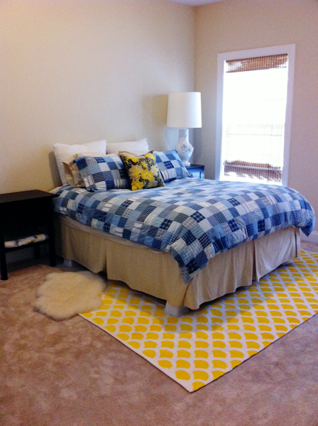
My plan is do get my stripe fix in Knox's future big boy room which currently looks like this (minus the lamp which is now gracing my new campaign dresser in our guest room).

photo(7)


Stripes come in every shape, color and size you can imagine, and virtually every combination looks good somewhere.   This is where the real trouble begins...too much pretty to pick from!

From subtle stripes...


To bold stripes...


To colorful stripes...


To vertical stripes...


Even diagonal stripes...


Of course, let's not forget ceiling stripes...


And finally, multicolored stripes...


See what I mean?!  It all looks good.  Graphic, fun, interesting...the perfect alternative to expensive wallpaper, especially in a kid's room where there's bound to be decor changeover throughout the years.  This last image is my favorite of the bunch I think. I like the width of the stripes and the subtle, graduated color application.  Yes, I believe we have ourselves a winner...

Do you have a favorite among the bunch?  Or have you already taken the plunge and gotten some stripey love in your home? Do tell!  Despite the approximate 6,539 images of striped walls I've already looked at, I could always look at a few more!


Later today I'll be posting some possible color combinations to achieve this look.  Come back, I need your opinions!